Martin Parr-The Rhubarb Triangle and Other Stories, Hepworth Gallery, Wakefield

 Study Visit, 12th March 2016

Hepworth Gallery, Parr Show (1 of 1)

Context

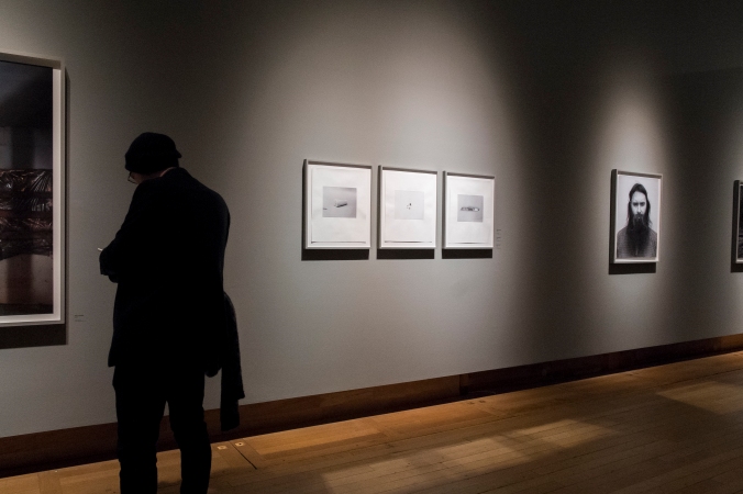
Rhubarb Triangle and other stories is a collection of work by the British photographer Martin Parr (b1952). I attended the exhibition with the OCA and this was my 5th study visit and the final visit while doing Expressing Your Vision.

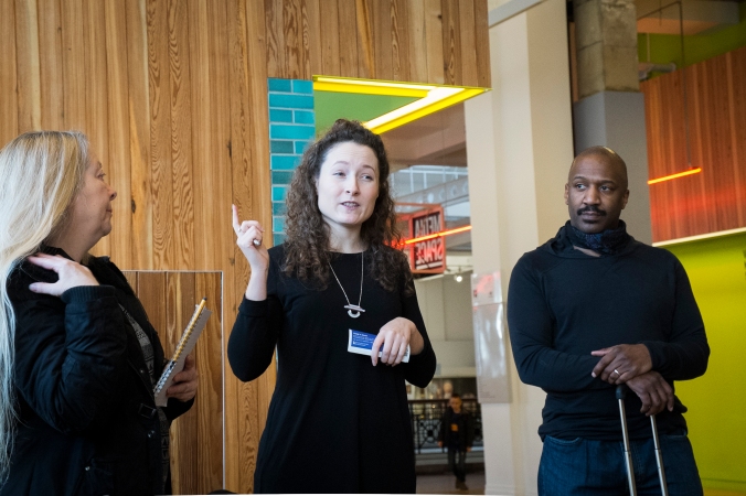
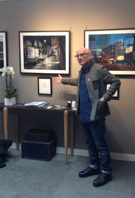
The event was led by OCA tutor Derek Trillo and there we 13 other students at the event. As with my other experiences of OCA study visit, the discussion and engagement with other students was really excellent. I have commented on this before in other blog entries, but I really do enjoy these study visits, they have for me offered a much more engaging and enhanced exhibition experience. The opportunity to talk about the work with like minded individuals is both enriching and really has helped develop my thinking and understanding.  A big thanks to Derek for leading the group and also Eddie Smith from the OCA office team who joined the group for the visit and contributed to the vibrant discourse on Parr and this work.

The Venue

This was my second visit to the Hepworth and I think it is a wonderful exhibition space with large, light and airy galleries. Named after the Sculptor Barbara Hepworth, who attended a school in the city, the current venue replaces a much more traditional building in the centre of the town (now used as a school). As an unashamed  fan of brutalist architecture I love the the interlocking trapezoidal concrete construction of this building which to my mind is utterly inspired. With relatively few visible exterior windows, the light within the gallery during daylight hours is quite frankly remarkable. The exterior of the building’s concrete finish reflects different wavelengths of light in different ways at different times of the day making the external appearance of the structure change in daylight and under artificial light. Having stayed in Wakefield the night before the study visit, I couldn’t resist photographing the Hepworth exterior by night.

Hepworth Gallery, Wakefield (1 of 1)

The Artist

I have always liked the quirky anti establishment tone of Martin Parr’s work although this was the first time I actually saw his work in the flesh, having until now only seen his images in books and on a screen of one sort or another. Parr seems to divide opinions, as evidenced by the initial reaction to his application to join the Magnum Agency. Some long term members of the agency were reportedly unhappy about the potential of him being accepted into this member led collective. Parr is also one of the early British documentary photographers to move to colour during a time when much documentary work was in black and white. Badger (2009) suggest it was Parr’s exposure to the work of friend and fellow photographer Peter Mitchell that made him look at the potential that colour offered to the documentary photographer. William Egglestone and Stephen Shore are also cited as influences in his shift to colour.

This event at the Hepworth was the first major retrospective of Parr’s work since 2002 held at the Barbican.


The Show- in all its parts

-The Rhubarb Triangle

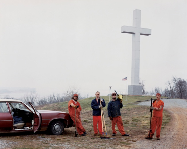
Central to this exhibition was a new commission, the work that is the title of the show. The Rhubarb Triangle is a collection of images made in the geographical area where forced rhubarb is grown, the triangle being made by the Yorkshire towns of Wakefield, Morley and Rothwell. Forced rhubarb is seen in some circles as being a bit of a delicacy and Parr’s work create’s a pictorial narrative journey in the life of forced rhubarb from its planting in the open, where it is then dug up and moved to the long dark rhubarb sheds where by candle light it is tricked into growing quicker, apparently sweetening it. The work then records its subsequent, picking, packing and consumption in a variety of rhubarb based products. I really liked the linear progress of the work that is in effect telling the story of this unusual crop.

That said, the thing that struck me most when I arrived in the exhibitions space was the sheer scale of the work. Presented as large prints, unmounted, unframed and pinned to the wall with what looked like high tech stainless steel drawing pins, the images fell into three broad categories. These were; posed portraits of individuals and/or groups, images recording people in action, whether in the fields, the rhubarb sheds or on the streets of Wakefield at the annual rhubarb festival. The final category of images were product type images of produce that featured rhubarb in its ingredients. This last type of image made a strong link for me to other Parr work around consumerism where he focused in on the minutiae of food and other products . An example of this at the show was the display of work from Parr’s ‘Common Sense’ series (discussed later).

Hepworth Gallery, Rhub (1 of 1)

Apart from the scale and presentation of the images Parr creates for me , a real sense of story in this work that is overt and very transparent. The images themselves which feature the hallmark Parr saturated colours, I felt were really quite beautiful, although I know that not all will agree. The strong pinks and yellows of the rhubarb plants dominated the gallery space although very vivid, I did feel the work was less extreme in the use of colour than other Parr works. The images didn’ t have the ’70s & 80s picture post card colour palette’ of for example: The Last Resort ( discussed later in this review).

I liked all the different categories of image within in the exhibit but some stood out more than others. In particular some of the individual portraits I found to be evocative and inspiring.

The image below is a good example, it is so expressive and could be straight out of a old master painting. Equally some of the images capturing activity have a workshop urgency about them.

Hepworth Gallery, Rhub portrait (1 of 1)

Whether you like Parr’s work or not, his technical execution of this work is to my eye without doubt superb. The level of detail, composition and exposure all serve to  capture his subjects with a high level of technical competence. The range of material sits well and the narrative of the work is clear and concise to my basic sensibilities!

This is perhaps not a surprise as one of the other OCA students alerted me that Parr made nearly 40,000 images in the execution of this work, these were distilled down to this final set. Whilst this sounds a lot (Frank made 7,500 images that became the 74 photographs that is the Americans, all be it in an area of film) I do wonder though, Parr has perhaps an ulterior motive in the scale of his shooting. As part of my preparation for this study visit I watched the BBC Imagine documentary about Parr. One feature of that stood out in this interesting exposition of Parr the man, was his obsession with collecting. In one scene where he is reviewing contact sheets, he says to Alan Yentob that most of the images on the contact sheet are for his archive and will never be printed. Parr seems to be a collector as well as an image maker.

In all, I was really taken with this work which I feel is sophisticated in its intent and executed beautifully and with the undertaking technical excellence they Parr demonstrates in his work. There is a strong sense of labour and tradition exposed in this work and there is something almost ‘out of time’ about what Parr has recorded here. The thing that really struck home was the sense of cultural record created by this work. There was something almost anthropological or ethnographic about the overall effect of the exhibition on me. It made me think much more widely about Parr’s contribution to a record about our culture. For me the work goes beyond art. Unashamedly I am an absolute fan!

It was also an excellent learning opportunity to compare and contrast The Rhubarb Triangle with several of Parr’s well know other works. I will consider these in turn.


-Work and Leisure

Work and Leisure was an assembled work from a range of Parr projects. It was perhaps the largest gallery space and images of work in various forms, were flanked on the opposite wall with images of people at Leisure. The contrast was somewhat obvious and although I found some of the images intriguing and engaging this part of the exhibition didn’t gell for me the way the other works did. I think it was the sense of anything and everything being photographed that perhaps troubled me the most. There were portrait images of coffee shop ’employee of the month, along side images of technicians working on high tech military aircraft, along side engineering workers in the black country. The image below, which  on investigation ( a small BAe logo can be found on close inspection) is I think a scene from the construction of two Trident Submarines has an epic quality and could be a straight publicity image. I got a real sense of Parr the collector in how this exhibit was arranged. I would like to have known more about the curation of this work and how much Parr had a hand in its assembly. My hypothesis is that he did not and this was someone else view of Parr’s work. This is of course just a hunch!

Hepworth Gallery Trident (1 of 1)

That said there was some excellent images within the set, that did reveal something about Parr’s eye or an image, for something interesting that can contribute to a greater whole. The leisure element of the work had a decidedly beach and sea influence ( a nod to Tony Ray Jones perhaps, as well as parr’s own work at seaside towns. There were other images, many of people at various forms of party or celebration.

Hepworth Gallery work and leisure 4 (1 of 1)

Like ‘The Rhubarb Triangle’, this exhibition was predominately printed on a large scale and pinned to the wall. Some of the prints were not particularly flat ( as can be seen in the submarine construction image above) and I think this creates a sense of the temporal and fleeting about the assembly display and ultimate removal of the exhibit. There was no sense of the protection or preciousness of the work, that can be a feature of framed exhibits. I liked the ‘matter of fact’ presentation of these works, the focus was clearly on the content with the presentation being less of an issue.
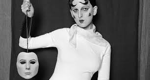
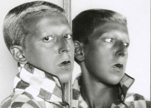
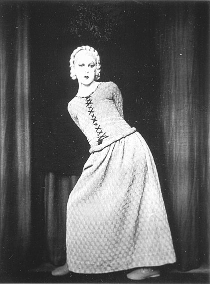

-Auto Portraits

This is a highly quirky,  but I think a revealing exhibit. In it Parr is photographed in a range of portrait styles and approaches reflecting different cultures and widely differing perspectives on what constituents a portrait to be made a preserved . There is something very whimsical about his face in so many genres, some that are quite tacky to my British cultural sensitivities

autoportrait 1\         LON91159-4

What at first appears to be just plain funny does I think reveal something about how portrait photography differs from culture to culture, indeed how photography and the still image is seen through the lens of different cultures. I am unsure of Parr’s original intent, but seeing all the individual works displayed simultaneously, rather than leafing through a book, made me think much more about how the portrait is a part of peoples lives in different lands. 

On reflection and although I enjoyed seeing it, this work for me did not sit well with the rest of the exhibits and again I pose the question about the curator’s choice in it’s inclusion. I know there are many deciding factors for the curator, one of which might be the artists preference, but also availability can be another critical influencing factor in the the choice of what might form part of a show. I need to learn more about the process of putting on and curating an exhibition. 


-Common Sense

On the far wall of the gallery that contained the ‘Work and Leisure’ display, Parr’s well known exhibit , ‘Common Sense’ was displayed. This is classic Parr, showing his keen eye for detail and his mission for finding and recording the absurd. The work says much about consumerism in the UK and the wider world and the lurid colours attest to the man made artificiality of the world around us.

Hepworth Gallery common ense 2 (1 of 1)

Hepworth Gallery, Common sense (1 of 1)

Made up of lots of individual prints of the same size, the work is assembled into a large grid creating a single work from the assembled pieces. I read in the Taylor’s (2004) review of this work that Parr has no preference for how the work is assembled and so again wondered about the selection in this instance and who made the choice about the order and content?

The work really shows Parr’s use of highly saturated colours in part created by the use of a macro lens and ring flash, allowing the artist to work in very close proximity to his subjects. In many case where people are in the images he must have gained a degree of trust to have been allowed to make some other images. The work also includes lots of ‘objects’ of one sort or another, all making reference to consumerism. 

I really liked the ‘attack on the senses’ that this work creates and out of the absurdity of some of the content comes so quite profound messages about the world about us. This work also reveals more about Parr as an investigator of culture and society.


-The Cost of Living

I had seen this work in book form and struggled with it. In many respects Parr is recording the mundane through the lens of ‘Thatcherite’ Britain in the middle class communities of Bristol. Parr made the work after moving to Bristol and it creates a window on middle class communities, perhaps as a counter to his critics about his focus on poor communities in work’s like the ‘The Last Resort’.

The images contain many of Parr’s recurring themes, consumerism, community and the consumption of food. In his very person style he is able to make images in very close proximity to his subjects, again attesting  to his capacity to gain the trust of those he is photographing.

scoffing-martin_parr

One thing I really noticed about this set was the less lurid colour palette used. Although Parr still deployed his fill flash and close up lens, and still quite vivid, the work was less extreme than some of he other works.

Of all he works at the show this one engaged me less, perhaps because of my own recollection of Thatcherite Britain in its heyday!


-The Last Resort

This was the work that  I was most familiar with although it was great to see it in person. I have owned the book of this work for some time and all the images were familiar to me.  Focusing on the resort of New Brighton, parr captures images of families and individual in what i always imagine to be holidays or days out. The colour pallet of the work is reminiscent of seaside post crds of the 70’s and 80′ and create a somewhat unnatural view of the world.

The images create mixed notions for me, they raise questions about the subjects and although they show some poignant family moments, they set these moments in some cases against a back drop of squalor. The scenes of bathers and seaside goers enjoying them selves amongst detritus and litter sits uneasily. Although Parr’s intent was perhaps to show not all was well within Thatchers Britain there is something quite unforgettable about this work. particularly those of children in questionable conditions. The recurrent themes of consumerism, food and leisure all appear in this work, further revealing the threat that run through much of his work.

martin_parr_the_last_resort_1146_67

I  know that the work was well received when first shown in Liverpool, but it received a very different reception when shown in London. Parr was accused of exploiting the poor and this critique may well have been an influence in his choice of subject for ‘The most of living’.

All of that said Parr does i believe again she his ability to say some thing greater than the pictorial in this work, he opens a window on the world that might not otherwise have been seen and his images describe something of society, culture and community in 80’s Britain. 


-The Non Conformists

This was a genuinely fascinating collection of images to see, not least because it was the earliest work I had seen of the artist. Made while he lived in Hebden Bridge , the work looks at the communities around the Chapels in the hills above the town. They provide a unique insight into communities that were clearly in transition when he made the work. This part of the exhibition also felt very different to the rest of the exhibition. The simple framing behind glass, work printed at a relatively small size and the layout  of the images was much more like a documentary photographers exhibitions I had seen by other artists. In saying this I am comparing the show to exhibitions of the work of  Cartier Bresson, Kertesz and Brassai, to name just a few. Again I asked my self questions about the nature of the curation and the choices made?

Hepworth Gallery, Wakefield non conformists (1 of 1)

There is a grittiness to the images, very much in the tradition of monochrome documentary photography. That said I think you can see the emerging themes that were to become part of his hallmark. The public consumption of food in particular being a subject he continues to return to. 

Some of the images have a real beauty about them to my eye as well as saying something about the community around the chapels he engaged with. The image below has a stark but simultaneaosly inviting feel and seeing it as a framed print at the exhibition, it had been so well printed that it looked to be illuminated from behind!


Key learning from this study visits

  • Parr’s work is all the more impressive for being seen as prints, I have been a fan of his work and I know have a greater understanding of why. He appeals to my interest in things beyond the image, thins such as the nature of culture and society. Parr is a sociologists photographer whose work contribute to understanding culture and community.
  • Parrs work might be quirky but there is a strong sense of technical prowess. the work is well composed and exposed beautifully, indeed it is full of revealing decisive moments. There is an irony in this, in that I have heard from other students ( although I need to track down a definitive source) that Cartier Breton was vigorously opposed to Parr’s membership of magnum
  • Parr does I believe, create a real senses of narrative in his work, he might have a keen eye for the odd and absurd but he is an accomplished story teller in pictures.
  • Before seeing this work I very much saw Parr as a bit of an oddity making quirky, but none the less beguiling images. I left the show with a strong sense of the seriousness in this work. Parr routes out and makes visible some otherwise hide truths about the world around us. This is far from trivial and really rather important!

Further lines of study

I am keen to explore some of Parr’s influences further, these include; Tony Ray Jones, Peter Mitchell-in particular his: ‘A New Refutation of the Viking 4 Space Mission’ work and Stephen Shore. I also need to learn more about the curation process and will undertake some private research on this theme.

References

Badger, G. (2009) Quoted from the introductionParr, M (2009) op cit

Parr, M (2009) The Last Resort, Dewi Lewis, London

Taylor, R. (2004) Martin Parr- Common Sense- Tate Summary found at: http://www.tate.org.uk/art/artworks/parr-common-sense-p78371 (Accessed March 2016)

BBC (2003) The World According to Martin Parr, found here ( Accessed March 2016)

Alec Soth: Gathered Leaves- Media Space-Science Museum, London

Study Visit, 23rd January 2016

Soth Tutor-4966

Introduction

This was my fourth OCA study visits and it proved to be an excellent event. Alex Soth’s work was something I was keen to see  in person and the organisation of this particular study visit led to a much more immersive exhibition experience than usual. It was a large group of students that attended and this added to the enjoyment and the learning opportunities offered during the day. I say an immersive event because of the way that the visit was structured. We started at 10.45am, with our tutor for the day, Helen Warburton, leading a leisurely but well structured tour through the exhibition. The tour through each of the exhibits in turn was augmented with a range of challenging questions for us all to consider. In addition to looking in depth at the work of the artist, Helen also encouraged us all to consider the structure and planning of the exhibition. Although exhibition organisation was an obvious topic to consider, this did make me think about the work in a different manner. After this we gathered and had a working lunch discussing the the exhibition and our reflections on what we had seen and how it made us feel.

This was then followed in the afternoon by a second tour of the exhibition, this time led by Kate Bush the exhibitions curator. This provided an additional and different perspective on the work and also offered a direct link to some of the artists thinking and decision making about the show. I felt better prepared to make the most of the curators tour because I had already looked at and reflected upon the work in the morning. This second tour augmented my understanding of Soth and his work.

We then concluded the day with a really engaging discussion and debate led by Helen that allowed for further layers of meaning to be considered, indeed revealed. In many respects it was an exhausting and long day but I travelled home feeling very fired up about the work I had seen and also with ideas for developing my own work in my somewhat idiosyncratic journey to try and find this illusive notion of personal voice!

Although a voice in my head is telling me I am becoming a bit of a broken record, I do need to say that this short review and reflection upon this OCA study visit doesn’t really do justice to the learning that this event afforded me.

I also need to note at that this stage that following the exhibition I have invested quite a few nights of further research into Soth and his work, in particular looking at a number of interviews and his motivation as an artist and lectures he has given so that I can gain a deeper understating of his work. This was very much in response to the motivating effect that the OCA visit had on me, not just in looking at the work that hung on the walls of the gallery space but also the excellent discussion and dialogue with other students at the event.

I am not sure who reads this blogs beyond me and my OCA tutor, but if there are any new OCA students reading this entry I really do want to extol the virtues of the study visit and the opportunity to discuss, reflect and debate the work at an exhibition with other motivated and engaged OCA students, it is a feature of the OCA that I really enjoy.

Exhibition context

Making a direct reference to Frank’s ‘ The Americans’ Soth traveled across America making the work  in this exhibition. The sum of its parts says something unique and also telling about the state of America and although it has not been made explicit in anything I have read or researched, this work is an ‘insiders’  view so to me is fundamentally different to the work of Frank in the ‘The Americans’

To my developing eye the work weaves between documentary, survey, landscape, portraiture and fine art creating and engaging and thought provoking images whose meaning is well beyond the merely pictorial.

The title of the exhibition ‘Gathered Leaves’  takes its title from the epic Walt Whitman’s epic poem ‘Song of my self’, this was a reworking by Whitman of an earlier work. Gathered leaves is a playful and ambiguous title and might refer to images but also pages in book, indeed a photobook may be referred to as gather leaves? In the same way Whitman reworked his poem over decades, Soth revisits recurrent themes distilling more and more about the american condition and the state of the nation. It is as much a sociological exploration as it is a visual one.

The exhibition was spread over four distinct spaces, each self contained and covering the the four bodies of work that make up the exhibition, Sleeping by the Mississippi, Niagara, Broken Manual and Songbook. Soth is clear that this is not a retrospective, suggesting to Brad Feuerhelm in his interview for American Suburb X that he is too young to have retrospective. Kate Bush ,Curator of the exhibit refereed to it a s ‘mid career, review. There is a real sense of progression not only in Soth’s development as an artist but also in his approach to sharing working. All of the exhibition rooms contain display cases with artefacts (maquette’s and finished photobooks) charting the development of Soth’s visual ideas and themes.

This is important because Soth himself suggests that the photo book is the ultimate medium to transmit work. In the interview with Feuerhelm he suggests:

“but still the book is kind of the ultimate container, shows come and go the book lives on”

Sleeping by the Mississippi

Sleeping by the Mississippi is a haunting collection of images that to me were filled with paradox and ambiguity. It is perhaps an example of landscape photography as metaphor but also as biography. Soth produced the work through a fairly epic road trip following the path of the Mississippi, which starts in the north near his home town and ends up more than 2000 mile later reaching the sea at the Gulf of Mexico. The work tells of his journey and engagement with people along the way. To european observers like myself, the Mississippi conjures up notions of the deep south, so this was immediately challenged by the opening images which are of snow covered landscapes of northern states in winter.  

Soth-4973

An immediately visible irony is that the river rarely appears in the pictures. Exploring the themes of religion, dreams, people and places along the way, the images were all quite beautiful and technically excellent. Shot with a 10×8 view camera the images in the gallery all looked to be predominantly 20×24 framed colour prints river which rarely appears in any of the images.  

Soth’s engagement with people comes through strongly in this work, in part perhaps through the slow and intensive process of using a large view camera. He needed to engage with the subjects to gain their trust, not least so that they were patient through the time it takes to prepare and make an image with a view camera. although there is a wide range of images, Charles Lindbergh’s bed( there are many images of beds and couches), Johnny Cash’s childhood home, convicts in a work detail working on the roadside and individuals who have shared their dreams in writing with Soth as part of the project.  

sleeping-by-the-mississippi-15
Copyright Alec Soth

A large vitrine in the centre of the gallery displayed various iterations of the photobook of the exhibit. This was particularly engaging because the contents ranges from the artist original Zine like machetes to very reversions of the final print volumes. It was really good to see how the work had developed. This first gallery also proved to be an excellent introduction to the work Soth and good preparation for what was to come next galleries.

Niagara

The next gallery contained ‘Niagara’, Soth’s study of this settlement on the Canadian border famous for its falls and cheap wedding motels. Described in the exhibition notes as the location of ‘spectacular suicide and affordable honeymoons’.

Niagara was created over 7 visits by Soth to Niagara Falls and its surrounding areas. The location again suggests contrast and contradiction,  it being a place where people go to get married and also to commit suicide.

That said the first thing that struck me though about this work was the huge jump in scale when compared to Sleeping by the Mississippi. The full effect of Soth’s use of a 10×8 large format  really jumps out. The prints were all on grand scale with all being many feet in dimensions.

Alec-Soth niag falls

Copyright Alec Soth

Central in the gallery was a picture of the falls taken from the tourist viewpoint and reflecting the postcards sold at the location and many peoples view of this location. It is a beautifully composed classic landscape image right down to the minutiae of detail in the clouds.


Many of the other images contrast with the grandeur of the falls, for example ‘Impala’, which I imagine is the name of the somewhat tacky looking motel, more reminiscent of a Watford industrial estate than a dream wedding location.  Soth is making a statement here about how trite this place is yet people for there for what is sometimes described as the happiest day of their lives!

Soth Niagara-4974

There were a lot of images of people, brides, couples, a swimmer, a very gaunt and a sad looking girl with her baby. If it was his intention to create a sense of a place of sadness but he achieved this. I think it was in this exhibit that he really anchored his ability to create a real sense of the emotions and culture of a place and whilst he may have been using landscape as metaphor, he was also in my opinion using landscape to share some  deep cultural insights. In addition to the melecholoc feel of some of the images there was also something almost whimsical, again demonstrating his ability to create a sense of place, with a capacity to go beyond mere location and explore culture, emotions and the ives of those that pass through a place.

A vitrine in the centre of the gallery space had a strange collection of artefacts,  maquette’s and love letters that the people he had met shared with him. It was clear from the display case contents that Soth is able to really gain trust and engagement with the people he photographs, they give him far more than just their likenesses on film!

BrokenManual

This was the third element of the exhibition and to me represented an altogether darker series of work. Initially inspired by the flight and subsequent fugitive in hiding story of  Eric Rudolph, the  Olympic Bomber, Soth began to explore individuals who took themselves ‘off grid’ and into the wilderness. America still has space enough for people to hide and this work explores many aspects of this fact.

There was a much darker feel to this work and this was also reflected in the subdued lighting of the exhibition space, bright  sptlights illuminated the works isn the darkened gallery.

Soth Broken Manual 1-4976

During his research Soth came across online communities of survivalists, individuals and groups, living on the margins or wilderness and certainly beyond american mainstream society. His subjects ranged from hermits, religious recluses, white supremecists, marginal and to some extent broken and troubled individuals. Soth also explored the written and online manuals and advice available to support those who want to live ‘off grid’, even creating a survival manual himself.

as-s.-alabama_1

Copyright Alec Soth

Much of the work was again on a very larges scale with the beauty of his very effective use of large format film shining through, even when the subject material was more troubling. It was again clearly evidenced that he engaged with his subject at quite a deep and meaningful level and I couldn’t help thinking there was some real risk in the body of work, given that some of those he made images of were frankly quite dangerous!

The vitrine in this space contained an intriguing collection of artefacts reflecting both research and engagement with this topihe exhibit is a collection of large scale works that mix environments  portstaure with sense 

Soth Broken Manual 2-4987

I was troubled by this work but also drawn to it, it appears to me that this body of images and artefacts, like the previous exhibits, provides strong evidence of Soth’s ability to peel back the layers of contemporary society, using his camera as a tool,  to make meaningful statements that transcend the pictorial content images themselves. Frankly, I was really moved by Soth’s skill, technical competence but most of al his insight.

Songbook

This was the gallery and exhibit of the show. It was also very different. Firstly although it retained the giant snake of the previous two galleries it was all in black and white. Also it was made digitally. Mimicking the news style photography. Soth had been a newspaper photographers in the early part of his career. the work explores the nature of truth and some of the text connected with th images come form the songs that were part of American culture in a time before rock and roll.

soth songbook

Copyright Alec Soth

Although there is a very journalistic feel to many of the large images there was something quite artificial about them too, perhaps it was the very quirky  and apparently posed subject matter of some of the images.

I did struggle somewhat with this part of the exhibition, in part because it didn’t have the dramatic beauty of the earlier works in the show, but also perhaps because I found less coherence with this work and the other three exhibits. I fully accept that this is about me though rather than the work.

There were also the mini newspaper publication that were aprs of the exhibit, set out in vitrines and produced in partnership with a print journalist friend. The overall effect t me was something helpfully mocking about the print media and its relationship with truth. As stated though I found this work the hardest to read, but none the less engaging.

Some thoughts on the nature of this exhibition

During  the curator led tour of the exhibition, Kate Bush referred to Soth as being a very generous artist. This was a direct reference to the contents of the vitrines in each of the exhibition spaces. Soth was very open about his book making process from the genesis of an idea to its final execution. Bush suggested that many artists keep their processes secret, just wanting to share the final work and not the journey to completion. Soth’s generosity is perhaps in part that he sees himself as an educator as well as artist. There is also something about his self confidence that allows this level of sharing. Both also perhaps feels that the work is more than the final images and i was veritably left with the sense of having visited a very intellectually engaging visual installation.

Little Brown Mushrooms is Soth’s publishing company, as stated earlier, the book really is his preferred medium.  I couldn’t help wondering about the title. In the days when I looked at the work of Ansel Adams and other f64 group photographers, the pulsihing house with the printing process Adams felt did justice to the zone system created  monochrome images he made is called Little Brown. This company still prints his collected works. I couldn’t help wonder was this choice of title a coincidence, may be may be not, it did set me thinking though!

Key learning points from the Visit


  • Landscape photography can be biographical
  • The notion of the road trip can be slow and evolving project
  • Landscape and portraiture can , when skilfully captured, sit well in a singular narrative
  • Print Big!! this work stood out for its ever increasing scal
  • Photo-books can go through a range of generations before settling on a final form. Soth’s show the development of ideas over time in a very revealing and inspiring manner
  • Engagement with subjects yields dividends, Soth’s slow but methodical appraoch engages his subjects allowing him to really get lots fro them
  • Immersion in a theme can lead to outcomes that were not originaly intended. Broken Manual in particular demonstrates this.
  • Soth, through this exhibition is utterly inspiring!!!

References

Soth, A. (2015) Gathered Leaves-Exhibition Notes

Soth, A. (2015) Gathered Leaves found at: http://mackbooks.co.uk/books/1094-Gathered-Leaves.html (Accessed  January 2016)

Video Interview with Soth:
https://www.youtube.com/watch?v=w91iWM_57RU

Claude Cahun: Beneath This Mask, East Gallery, NUA, Norwich

Exhibition Visit, 9th  January 2016

Cahun NUA (1 of 1)

‘Beneath This Mask’ is a collection of 42 black and white images made by Claude Cahun between 1918 and the mid 1947. The images were displayed in symmetrical groups in the new Gallery East that is part of the Norwich University of the Arts. This collection is part of a travelling exhibition from the Hayward South Bank Centre. I was not familiar with the work of this artist prior to the exhibition but found it a very rewarding and thought provoking exhibition principally because:

  • Cahun’s work looked to me to be avery much ahead of its time
  • Cahun’s surrealist experiments with gender identity are as relevant now as when these images were made, nearly a century ago in some cases.
  • Cahun’s use of strong composition, self parterre and theatrical poses made m thinks in a different way about the photograph as information and the themes explored in the final section of Expressing Your Vision

Claude Cahun was the taken name of Lucy Renee Mathilde Schwob a French citizen born in Nantes in 1894. She was the niece of Marcel Schwob the avant-garde writer. Cahun contributed to the surrealist and avant-garde movements through her photography and writing, although her recognition only came posthumously.

Cahun 1

Copyright Jersey Archive

The work which is very biographical, contains many self portraits, some of which are very theatrical in nature. In some of the images she photographs her life long companion Suzanne Alberte Malherbe. Like Cahun Malbherbe took on a gender neutral pseudonym, Marcel Moore. Together they moved from France to Jersey in the mid 1930’s to pursue their artistic endeavours.
Of particular interest to me as I researched Cahun was an exhibition of her work staged by David Bowie in 2007. Given Bowie’s recent death, ironically the day after I saw this exhibition, it is interesting to view Bowies work through the lens that Cahun was creating half a century before Bowie experimented with gender reversal and an androgynous presentation of self.

Claude_Cahun

Copyright Jersey Archive

As mentioned there is a clear exploration of gender and many of the images present an an intentional androgynous view of the subject. In the 1920’s Cahun was experimenting with gender at a number of levels and was also involved in theatre and writing as well as photography. The link to theatre is interesting, in that her work explores different persona’s, a feature of theatrical work in general.

I have to say I found many of the images strangely contemporary in terms of the portrayal of their subjects, indeed it was hard tho think that many of the images were 70 or 80 years old. I was not surprised to read in the exhibition notes the links made to the work of Cindy Sherman.

In the organisation of the work there was a real sense of exploration and the self portraits move from being theatrical to being much more explicitly surreal. I was left with a sense of an artists pushing boundaries in a time when making this sort of work will almost certainly have been treated with challenges

Claude-Web-1

Copyright Jersey Archive

Cahun was a resistance activist during the Nazi occupation of the Channel Islands and was eventually arrested and imprisoned. Sentenced to death by the German administration on the islands she was saved from this fate with the liberation of Jersey in 1945. In reality though the death sentence was only postponed, her health was severely damaged by her time in prison and Cahun died at the age of 60 in 1954.

images cahun

Copyright Jersey Archive

In summary I think Cahun was a ground breaking artist , ahead of her time who has only recently been brought to modern audiences. There is much to learn about surrealism from her work and she offers an alternative approach to that of other artists of her time and those who came later in exploring the power of images to investigate and challenge gender and self.
References

Claude Cahun: Beneath This Mask: Exhibition Notes, Hayward Touring Exhibition 2015

David Bowie on Cahun: found at http://www.davidbowie.com/news/tonights-high-line-david-bowie-recommends-21926 (accessed 12/1/2016)

Claude Cahun: The Soldier with no Name: found at:http://www.fluxmagazine.com/claude-cahun/ (accessed 12/1/2016)


Photography as information

Some reflections on the course notes

Photographs contain huge amounts of information. Even those with limited pictorial elements, this I believe is because we all ask questions about the photographs we see. As discussed in the Research Point here, there is also information surrounding a photograph that shapes and to some extent guides how an image is interpreted.

Flusser’s comment on page 109 of the EYV course materials raises the question about intent and how as image makers photographers try and create something new out of things that have been seen before. I think Sontag suggested that everything has already been photographed, although I need to re read ‘On Photography’. I guess this idea of creating something new is at the heart of the whole Expressing Your Vision concept. How can the photographer create something new out of the common place?

I know from my own image making that the idea of a new and different interpretation of subjects that have been photographed many times before is a key motivation, even if I fail to achieve my aspiration the chase is is part of the alluring joy of photography.

illuminance

Copyright Rinko Kawauchi

The front cover of Rinko Kawauchi’s book ‘Illuminance’ has an image of what appears to be an over exposed flower or plant, possibly a rose. Although over exposed, the plant can be seen in the context of other plants in the out of focus bokeh of the background. In spite of the brightness of the image and the out of focus burned out highlights, the image still contains information of sorts. Given the title of the book, Illuminance the image seems an appropriate cover piece for the work.

I think this type of image probably challenges the concept that the best transmission of information is done with well exposed and sharply focused images. As my blog entry on the Part 5 Research point highlights, the clarity of the an image does not necessarily provide more truth, meaning or information. Kawauchi’s image itself provides Internal Context, given I can tell what it is and I can say something about the pictorial elements within it. Because I know it is a book cover I have some thoughts and information about its External Context. At this stage though I have limited information about its Original Context although I could gain this by getting hold of a copy of the book and investigating it further. From an out of focus over exposed image I have already gleaned a lot of information.

In short, there is much to read from the image at all levels and it isn’t depenedant on technical accuracy from a photographic point of view.


References

Bloomfield, R. (2014) Photography 1, Expressing Your Vision, Open College of the Arts, Barnsley

Kawauchi, R. (2012) Illuminance, Aperture, New York


Chapter 5 Research Point (pp106)

Terry Barrett on Photographs and Contexts

This research point asks students to consider how images, photographs can and are interpreted. Terry Barrett’s helpful articles encourage some very specific considerations to be made.

Firstly the importance of understanding the difference between a photograph and the reality from which it has been taken. He uses the term ‘segments excised’ to describe the moment in time that the photograph is taken.

He makes the point that it is important that students of photography understand the difference between the photograph and the reality from which it has been taken, urging viewers to consider and appreciate, the photographers intent, he suggests:

appreciation of photographs is dependent on recognsizing and understanding a transformation the photographers has made in excising the segment and instant to make it aesthetically noteworthy rather than routine and mundane.”

He is asking us to consider the photographers intent it the image they have made. Not taking this position and simply seeing the photograph as a record of a moment in time he suggests makes the photograph ‘transparent’ and the viewer is left considering the only photograph itself and not the photographers work in making the image.

To assist in this analysis he describes in detail three types of context that assist in understanding an image.

The first is the Internal Context, that which is contained within the frame, the elements that are evident within the picture. This can include the elements of the image, the composition, exposure, angle of view, all the choices the photographer made (or didn’t make) as part of the image making process. Barrett suggests in some images this is enough to interpret the intent. Advertising photographs for example seek to provide enough ton guide the viewer to a conclusion based upon what is contained within the frame.

Additionally Barrett describes the Original Context, the information that informs how the photograph is interpreted. He suggests that some photographs are ‘inscrutable’, that is impossible to understand or interpret without some additional sources of information for outside the photograph itself. Other photographs because of the nature of their content, what is within the frame.

Original Context therefore broadly refers to that which was physically and psychological present at the time the photograph was made. Bloomfield describes this in the EYV course notes as the information about how the picture was made. In an earlier Blog post I refer to this principle when considering the image below by Robert Capa. It becomes much more meaningful when we know that Capa was aboard one of the early lading barges on the beaches ate Normandy on D-Day. I didn’t realise it at the time but my blog post here was describing Barrett’s concept of Original context.

capa

Copyright Cornell Capa

Finally Barrett describes the External Context, referring to the presentational context of the photograph. This creates furthers layers of interpretation. In his extended article on this context in Goldblatt and Brown (1997), he describes how a single image can be widely interpreted and misinterpreted based upon its presentation. Like the earlier 1986 article from Art Education he makes reference to the work of Freund (1980) (pp178) and her commentary and analysis of the image below made by Robert Doisneau.

Doisneua

Copyright Doisneau Estate

The picture of a man and women drinking wine in a cafe, the image appeared in: Le Point, devoted to cafe’s as an exemplary scene of cafe life, but it also, without Doisneau’s permission appeared in a pamphlet about the evils of alcohol. Even later it appeared in a scandal sheet magazine with the caption “Prostitution on the champs elysee”. This was again used without the photographers consent and led to the man in the photograph suing not only the magazine but Doisneau too. The court awarded the man compensation from the magazine and the photo agency but acquitted Doisneau. Barrett (1997) describes this as Category Displacement, that is where new text creates a new meaning and interpretation of an image.

This research point raises huge questions about photographs as information, as works of art and how context can define narrative with or without the consent of the photographer. It challenges the early views that photography offers a truth! I suspect I will explore these themes further if I make it to the OCA Context and Narrative module!

References

Barrett, T. (1986) Teaching about Photography: Photographs and Contexts, Art Education July 1986 Vol. 39, No. 4, pp33-36

Barrett, T. (1997) Photographs and Contexts in Goldblatt,D. & Brown, L (Eds) (1997) Op CitBurgin, V. (1982) Thinking Photography, Macmillan London

Sekula, A. (1982) On the Invention of Photographic Meaning in Burgin, V. (1982) Op Cit

Goldblatt,D. & Brown, L (Eds) (1997) Aesthetics: A reader in Philosophy of Arts, Prentice Hall, New York

Fruend, G. (1980) Photography and Society, David R. Godine, Boston, Mass.

‘View from a Judgment Seat’-Quentin Bajac in conversation with Philip Gefter- Aperture Blog

Some short reflections on the article beyond its immediate relevance to section 5 EYV

myop_alce_s1790_68078

Quentin Bajac- photo copyright Ed Alcock

I read with interest the referenced article on the aperture blog, highlighted in section 5 of EYV (pp105) because of the Paul Graham reference. Bloomfield’s (2014) reference to ideas developing and changing during the process of executing a project are of interest and link to my own emerging thoughts about practice dictating the final out come of a project rather than sticking slavishly to a concept from the start of a process, idea, project or assignment. I will pick this theme up later but I was also interested in the wider content of the article and this short reflective writing piece picks up some of these wider themes.

The interview sheds some light on the role of The Museum of Modern Art’s (MOMA) role on photography over a number of decades. MOMA known the world over as a centre of modern art with photography being a key area of its work.

Quentin Bajac as the then new curator (January 2013) is in conversation with Philip Gefter who writes about photography. The interview raises some interesting issues about the role of  MOMA in the development of photography as an art form over a number of years.

The role of curator of photography at MOMA has in the past been referred to as: the judgement seat of photography. Bajac clarifies this suggesting the the history of photography being written by MOMA is now in competition with histories of photography being written by other institutions internationally. In short MOMA is one of a number of judgment seats on photography.

The conversation also considers the historically american centric view of MOMA regarding photography, indeed implying the photography was seen as fundamentally being an america centric art form. Bajac quickly replies that this might have been the case in the past but MOMA is in a different place now. Indeed the appointment of a european as the curator is perhaps a way of amending this history.

When asked about the mark he would want to leave on the photography department at MOMA, given the high profile predecessors in the role: Beaumont Newhall, Edward Steichen, John Szarkowski, and Peter Galassi, Bajac replies:

“to leave the museum with a photography department and collection that is more fully integrated into the museum’s collections, more in dialogue with the other departments, and more global in scope.”

Is he perhaps suggesting that photography still sits outside the notion of art as seen in great galleries and collections? I am unsure, but it is an interesting thought to ponder!

References

Bloomfield, R. (2014) Photography 1, Expressing Your Vision, Open College of the Arts, Barnsley

Gefter, R. (2013) View from a Judgment Seat-Quentin Bajac in conversation with Philip Gefter found at: http://aperture.org/blog/view-judgment-seat-quentin-bajac-conversation-philip-gefter/ (Accessed December 2015)

Quentin Bajac’s background experience can be found at: Bajac

Frantz Fanon- Bruno Boudjelal, Autograph ABP, Rivington Place, London

Exhibition Visit, 5th November 2015

While in London for work recently I found  a couple of hours to revisit Rivington Place to see the Bruno Boudjelal exhibition, ‘Frantz Fanon’.

His reflective and somewhat haunting work about the life of Frantz Fanon, the anti colonial writer, philosopher and Psychiatrist, was set out in a single gallery space at the venue.  The work was displayed in a very darkened room with the images illuminated with spotlights. This arrangement set the tone of the exhibition in many respects and I think augmented the effect the artist wanted to create with the work. On the opposite walls to the images were quotes from Fanon’s life and work, these were in differing size fonts, perhaps suggesting emphasis?

I was familiar with Fanon and in particular his final written work: The Wretched of the Earth, originally published in 1961 and now a Penguin Classic.  As a student in the early 1980’s I had read this book along with other writings by Fanon. His work challenged colonialism, the impact of occupation and the lasting racism inherent in colonial powers. As a doctor and Psychiatrist Fanon presented a unique view of colonialism and oppression. How Fanon is seen today depends on ones perspective and these can range from him being a visionary anti racist, all the way to a political and revolutionary leader.

The artists statement about the work says:

“This series is based on Frantz Fanon; a Martinique born French-Algerian psychiatrist, philosopher, revolutionary and writer whose work is influential in the fields of post colonial studies. I felt it was important, at a point where Algeria is celebrating its fiftieth birthday, to consider the thoughts and life story of Fanon, his relation with Algeria, his position as one of the most important post-colonial thinkers, and finally the story of his journey as a human being.”

Bruno Boudjelal

The exhibition its self was a collection of large scale black and white prints taken in locations where Fanon had once lived. These included images of his birth place in Martinique, images of Algiers, Blida in particular, where he practiced as a psychiatrist and formulated many of his most influential ideas and images of Tunisia where he spent the last days. There were also images of individuals, one of the portraits was of an old man who had been one of Fanon’s last patients.

The images had a ethereal almost ghost like quality and had the look of very aged ‘personal’ photographs, the sort that can be very valuable to their owner but have less meaning to wider viewers. The image below typifies this, it is vignetted, focus is uncertain and the image was taken at an ‘off true’ angle. This was I assume the artists intent.

Fanon-18

Copyright Bruno Boudjelal

Looking at the images I was reminded of Clare Strands work: Getting Better and Worse at The Same Time‘. A central premise of this work as Strand (2015) sets out is:

“……can works continue to degrade yet still retain their value, their aesthetic and maintain a sense of reason.” 

Boudjalel’s has perhaps intentionally created this sense of the past seen though apparently aged and in some respects degraded images. They create a mood rather than a sense of the pictorial.

It is strange the thoughts that come to you in a an exhibition because I also thought about Sontag’s (1977) reference to Jean-Luc Goddard’s 1963 film ‘Carabiniers’ in which the treasure and spoils that two peasant soldiers bring home after war are a suitcase full of photographs, photographs seen as having intrinsic value as objects, artefacts and to many, treasures. 

Although very loosely pictorial, Boudjelals gave me a sense of images as treasures and this added to the biographical journey through the key locations in Fanon’s life. The work also seems to create a sense of melancholy, of things lost and forgotten places. Perhaps also Fanon’s work. As an experiment I asked the attendant in the gallery about their knowledge of Fanon, they had none prior to the exhibition. I wonder was a motive for Boudjelal to reflect that Fanon may now be forgotten or less prominant?

This is particular poignant in the present time with media coverage of the refugee crisis and the racism that seems to abound. Fanon and his commentary on the psychological impact of post colonialism, seems to be very current in many respects.

The images all had a aged look, the artists had I think wanted to create a sense of time passing and the look of an old photograph. It was only after the exhibition visit that I read that the gallery had billed it as an installation. In hindsight, this makes sense because  I think the artist wants the viewer to have a sense of Fanon and his work as something of the past, but simultaneously link to to the present.

From a purely photographic viewpoint Boudjalel presents the medium as a different way to consider a biography. His use of a somewhat oblique imagery of a place, presented as intentionally  ‘aged’ looking photographs, the sort that might be kept by an individual as a memento, set the tone of the whole exhibition. Whilst the work was essentially records of landscapes and people, this work could perhaps be seen as a sort of aftermath  documentary style?

In summary the exhibition was engaging and I was left with a desire to re read Fanon’s “Wretched of the Earth”, something I am currently doing. The power of images to spark action in the viewer!

Fanon, F. (1961) The Wretched of the Earth, Penguin ,London

Sontag, S. (1977) On Photography, Penguin, London

Strand, C. (2015) Getting Better and Worse at The Same Time, found at : //www.clarestrand.co.uk/exhibitions/?id=306 (Accessed 15 November 2015)

East London Photography Festival

Study Visit 24th October 2015

This was my third OCA study visit and it proved to be an excellent learning experience. My group was led by Rob Bloomfield and he struck a good balance between allowing students time to engage with the work in three separate exhibitions whilst also providing tutorial support through comments and questions. This approach does make a study visit a much more valuable experience than just a visit to an exhibition.

All three exhibitions that were part of the wider East London Photography Festival were quite different in terms of themes and content and in terms of the learning opportunities they offered to me. I will describe each in turn and as ever in such a blog entry it is in reality hard to do justice to the full experience each of the exhibitions offered.


DriftPhotography of contemporary urban environments, Shop 7, Truman Brewery

Drift 1 (1 of 1)

Drift, my experiment shifting perspective

The first visit of the day was to the Truman Brewery, Shop 7 Gallery, a shop like venue in the heart of the shopping streets off Brick Lane and part I believe of the Truman Brewery complex.

As the exhibition guide states:

‘Drift Exhibition will bring together the work of 11 up an coming international photographers as part of the Urban Photo Fest in conjunction with Tate Britain during Photomonth East London in October 2015’

This was a very mixed selection of work by a range of artists who had just completed the Goldsmiths College MA in Photography and Urban Studies. Rob Bloomfield alerted us that this was in effect the final year show for these students. Some further research revealed that this show had been crowd funded using Kickstarter and this funding had provided the resource for the exhibition, the hire o the space and the production of the associated materials. Rob also let us know the fact that this was not a curated exhibit. This was clear upon arrival at the gallery. To me there was too much work in too small a space, this is not a criticism, but rather an observation. That said I have not visited degree shows and this might be a feature of this sort of exhibit.

Further research also highlighted that the course the students had followed was in the Sociology Department at Goldsmiths and social and cultural learning is a large part of the programme of study and research they had followed. In retrospect this made sense because the associated exhibition guide at first reading appeared quite oblique and initially not that easily accessible. The artist’s motives were I assume, much more complex than the images initially appeared.

Because of the wide range of work in the exhibition I chose to focus on the work of a small number of the artists work on display after my initial survey of the whole body of work. I then gravitated to the work that I found the most engaging. I will talk about these in turn and reflect on my own learning from the visit.

Bas Losekoot – In the company of strangers

Of all the artists I found this work the most accessible. This was an interesting collection of very clear and sharp scenes from the city that were beautiful and full of detail. The work posed questions. Images of people going about their business but framed and composed to reveal something about life in a large city. Losekoot himself suggests:

“I have always conceived the street as spectacle; I spend a lot of time observing its movement, rhythms and patterns.”

What was most striking in the images were the notions of relationships, loneliness and alienation, all very common themes for the street photographer. Losekoot had however managed to capture some genuinely intriguing moments that ask the viewer to think about life in an urban context.

Although different, there were some similarities to the work of Philip-Lorca Decorcia in his work ‘Heads’ I thought. Something about the light and sharpness, but also the sharp homing in on the subject leading the viewer to consider questions about their lives. I also found some similarity to Paul Graham’s recent work: The Present. In particular the image below which I think is particularly powerful with its allusions, the city, power an possibly alienation. There are several images in Graham’s work that also suggest revelation. This was particularly a feature in the  Losekoot  work I feel.

01+In+Comapny+of+Strangers+-+Bas+Losekoot+_BAS8254

Copyright Bas Losekoot 2015

In all I found this to be an engaging set of images that left me wanting to see more and research Losekoot’s work further.

Carlo Navato – Spaces and otherness

The large-scale square images of this artist drew me too them immediately. At first they appeared to be abstract and simple. On closer inspection they contained considerable amounts of information. Reading the exhibition guide the work was inspired by Michel Foucault’s 1967 essay ‘Des Espace Autres’. I was familiar with Foucault’s essay and the concept of heteropia and had read of others using the term to describe  a space as having  the potential to have more layers of meaning than initially meets the eye. This is a recurrent theme in writing about architecture and the built environment.

I think the artist had really captured Foucault’s concept in the art he had created. Take for example the image below, although simple the snow covers up the real details of the place leaving the viewer uncertain about where and what this image is about.

Navato

Copyright Carlos Navato 2015

Our associations with a traffic cones are similarly multi layered, for example as part of an official action (on road or car parks) and also whimsically, when they are stolen and placed in other some times inappropriate places. And of course sometimes they are just abandoned.

The simplicity of the scenes in all his images and their composition belie the complex questions that the works pose. I was left wanting to see more of this work

Although perhaps siting within the landscape genre, each of the images in the set had signs of human presence in the landscape.  Again I liked this work and will undertake some further research into this artist’s work. I was also interested in the artist’s use of quite muted colours, which worked well with the very, linear and graduated composition of the work. The composition also presented challenge, again in the image above the proximity of the top of the cone to the trees in the far distance and the horizon, slightly jar, but also satisfy! All in all very engaging work to me and my interest in rural landscapes as but environment


Beatrice Tura- Terra Firma

Beatrice Tura’s work was one of the smallest exhibits in the show. With just four monochrome framed images her work focused on  the notion of the ‘constant movement’ of the urban soil. We had the advantage of Beatrice talking to us about about her work at the gallery. She described how her work records the changing city through images of the ground, indeed she talked about seeing change and the transient, by looking down at your feet. In summary, the constant change in the city takes its toll on the surfaces on which we walk and the changing ground beneath our feet. It is this that she recorded, perhaps at a metaphor for the ever changing urban landscape.

She described not setting out with a specific idea in mind when she started to make the work. Rather, as she saw scenes she then recorded them and then developed the idea from this.

In many respects this is very different to the approach I am taking in my OCA course of study where planning and preparation are very much in advance of any image capture. This artist offered an interesting and valuable alternative and insight into how she worked and how her work developed over time.

There was an abstract simplicity to her work that can be seen in the image below.

tura 2

Copyright Beatrice Tura 2015


Keith Greenough – Lifting the Curtain, The Town House Gallery

Keith Greenough’s (a recent OCA Graduate) exhibition, ‘Lifting the Curtain’ was a high point of the study visit and the second exhibition of the day. What was particularly enjoyable was that the artist was there in person and he delivered an excellent overview of his work, setting out his motivation, the genesis of the work, how he researched and developed the idea and how he executed the whole project. His description was both engaging and informative. A real bonus was the insight he offered into understanding final year work with the OCA.

Keith 1


All photographed in the East End of London and based on a contemporary take on a Victorian survey of the poor, the exhibition was made up a large beautifully composed and exposed colour prints taken in the pre dawn hours.

Andrews Road

Copyright Keith Greenough 2014

As Keith described in his excellent talk, Charles Booth a Victorian philanthropist undertook in 1889 a survey of poverty of the urban poor in East London. Booth’s survey created a view that suggested:

“East London lay hidden behind a curtain on which were painted terrible pictures”.

Keith’s work captured something of the spirit and cadence of the statements and quotes about the urban poor recorded by Booth in his survey. The interplay between text and image is excellent and what is created is something greater than the sum of the parts. The work illustrates something Keith referred to as the use of ‘parallel text’, not captions, but rather words that encourage the viewer to think and conceive of the images in a range of ways. For me this worked very well. Keith’s contemporary 21st images did transport me back to the time of Booth, asking the question, how much has really changed? I had come across this notion of the link between image and text in my study of the work of Paul Seawright, although it was Keith who used the term parallel text. Like Seawright’s 1988 work: Sectarian Murders, Keith was operating in the realm of Aftermath photography, a subtler and indeed oblique take on the concept of documentary photography. Cotton (2004) in fact describes this approach as a sort of anti documentary image making.

From a purely photographic perspective the work has a cinematic quality, in part created by the large very high quality colour prints, but also by the level of detail delivered by Keith’s use of medium format digital image making. There is to me a very sophisticated and simultaneously satisfying composition to the images and the  light within the compositions is to my eye quite beautiful. Keith explained his rationale for using a large format view camera with adjustments allowing him to correct verticals in the buildings he photographed. The use of digital technology supported the sense of urgency he described in the actual image making, not least because he chose to make the images in the hour or so  before sunrise, when the streets would be deserted of people and traffic. This gave him all the advantages of the view camera for architectural work, but the immediacy of a digital medium.

Wentworth Street

Copyright Keith Greenough 2014

I found the work very engaging because it created a level of intrigue, the absence of human activity in the heart of the city raises lots of questions for the viewer before the text associated with each image is even considered.

The text connected to each image had been taken directly from Booths survey and was even printed in a font matching the printing in the original published survey, a very nice unifying touch.
A further connection I found really interesting and important in this work was the link to my current to work within chapter 4 of Expressing Your Vision, the language of light. In particular the beauty of artificial light. Keith’s choice to make his images in the brief time before sunrise, when the city scenes he selected would be devoid of human activity and also bathed in the light of sodium, mercury and neon. I have really been drawn to this part of the Expressing Your Vision course and Keith’s work significantly influenced my choice of assignment 4. More about that within the background notes with assignment 4.


Syd Shelton – Rock Against Racism,  ABP Autograph Gallery Rivington Place

This was the final exhibition of the day and one that I had very much been looking forward to seeing. As a 50 something Shelton’s work about an important period in British history was all about my generation. In truth I was not prepared for its how much nostalgia this collection of images had on me! Seeing friends from school  in three of the images sealed the overwhelming sense of nostalgia the exhibit had on me. In fact I travelled to London two weeks after this first visit to look at the work again, to really get a sense of the work from a photographic, documentary and artistic perspective.

RAR 2 (1 of 1)

The ABP Autograph gallery space was light and airy and the walls were filled with many 24×16 and 24×36 prints taken from Shelton’s 35mm negatives taken between 1976 and 1981, documenting the rise of the Rock Against Racism movement. Shelton, along with Red Saunders and members of the music community created Rock Against Racism in response to growing racist tensions in Britain. Ironically Shelton had been in Australia prior to the Rock Against Racism’s formation photographing the plight of aboriginal communities an their challenge living in urban Sydney. As Tulloch (2015) suggests:

“Shelton joined Rock Against Racism in early 1977 on his return to England from Australia. He did so because he found his birthplace a more racist than it had been when he left”

The work in the exhibition was predominantly large black and white images but also augmented with graphic work from the Rock Against Racism publications ‘Temporary Hoarding’ to which Shelton was a key contributor.

There is a real sense of social commentary in the work, which for me places it squarely in a ‘real time’ documentary genre. Shelton is not neutral though. By this I mean he was not a passive observer as some documentary image-makers. Shelton was at the heart of the activity using a mix of posed images and captured candid moments to contribute to the Rock Against Racism movements principles.

Again Tulloch (2015) says of the photographer:

“for Shelton this work was socialist act, what he call a graphic argument”

This is an important lens through which to see the work as whole. It was intended to make a difference, rather than just document.

That said it does document an interesting period in British history very well. From the repugnant National Front marches in the East End of London, through the initial Rock Against Racism events and on to the various Rock Against Racism and Anti Nazi League concerts around the England. Through these events young people around the country came together through music such as, Punk, New Wave, SKA and Reggae to make a statement against racism.

The quote below one of the large images of the crowds at the Rock Against Racism / Anti Nazi League Carnival 1 held on the 30th April 1978 in Victory
Park, Tower Hamlets, seems to sum up the purpose of the movement and perhaps something of Shelton’s motives for the work:

“…the moment when my generation took sides”

Billy Bragg

I was particularly pleased to be able to see the 35mm contact sheets for many of the images in the exhibition, they showed Shelton’s selection and cropping and gave some insight into his thinking. I also couldn’t help be impressed by the large evocative prints made from these tiny pushed HP5 and TRI-X emulsions!

There are far too many images to talk about in detail but the three images below set out in my view the essence of his important and inspiring body of work

pursey

In the image above , which shows the scale of attendance at the Victoria Park concert, Jimmy Pursey of Sham 69 has just read a speech to the crowds.  Although originally billed to play at the event, Sham 69 didn’t play at the concert  because they received death threats. A measure of the tensions of the time. The image has an almost biblical quality and the single person in front of the crowd, the look on his face and the stark grainy monochrome of the picture say much about the mood of the day.

bethnal

Copyright Syd Shelton

In this posed image Shelton’s captures a fantastic look of defiance and confidence in the faces of this group of young people . Taken in Bethnal Green, the subjects must have been very much part of the youth close to the centre of Rock Against Racism’s activities.

RUTs

Copyright Syd Shelton

Fans of the Ruts getting on to the  the stage at West Runton Pavilion, Cromer, Norfolk, in 1979. An image that is so much of its time!

Like many others of my generation this work struck a chord beyond nostalgia, a reflective thought about the politicisation of youth and the impact of young people from very different backgrounds coming together around a common cause.

As we read about right wing reactions to the Syrian refugee crisis in the autumn of 2015, there is more than ever the need to resurrect he spirit of April 1978!


Short summary of the day

This was an excellent but intense day. There does come a point where I am challenged to take in more information. I have for many years visited exhibitions but probably as a more passive observer. Since starting with the OCA I am trying to be much more engaged with the work, reflecting on it more deeply and thinking about how viewing and thinking about the work of other artists can inform my own developing voice. A really excellent day and a big thanks you o the OCA and fellow students for making it a very memorable event.

References

Cotton, C (2004) The Photograph as Contemporary Art, Thames and Hudson, London
DiCorcia, P-L. (2001) Heads, found at: https://thephotographyblogger.wordpress.com/2011/03/27/famous-photographer-series-philip-lorca-di-corcia-heads/ (accessed 1st November 2015)
Foucault, M. (1984) Des Espaces Autres. Hétérotopies- found at:http://foucault.info/documents/heteroTopia/foucault.heteroTopia.en.html (accessed 1st November 2015)
Greenough, K. (2015) Lifting the Curtain found at: http://www.liftingthecurtain.net/ (accessed 1st November 2015)
Losekoot, B. (2015) Quoted in Drift (Exhibition Guide)
Seawright, P. (1988) Sectarian Murder- found at: http://www.paulseawright.com/sectarian/ (accessed 1st November 2015)
Shelton, S. (2015) Rock Against Racism ABP Autograph, London
Tulloch, C. (2015) Quoted in Shelton, S. (2015) pp11, op cit


A personal reflection on the Henri Cartier-Bresson documentary: ‘L’amour de court’ (‘Just plain love’, 2001)

There can be few people with an interest in photography that would not know something about Henri Cartier Bresson. The notion of the ‘decisive moment’ and Cartier Bresson’s catalogue of iconic images, capturing memorable moments in time, must truly make him a central figure in photography’s canon of leading exponents of the art.

Through a long-term interest in the work of photographers associated with the Magnum Agency I was familiar with this photographers work, Cartier Bresson being a founding member of the agency.

It was in this context that I watched (several times) Raphael O’ Byrnes haunting documentary ‘L’amour de court’. Made in 2001 when Cartier Bresson was 92. I was immediately struck by the contrast between the apparent frailty of the famous photographer with the still sharp vivacity of his thinking, humour and wisdom.

Looking more deeply into the content of the documentary, his desire to look forward and move on, was quite uplifting. ‘L’amour de court’ was in many respects simultaneously inspiring and melancholic, the content of the documentary was at times quite broad and wide. The early section about image making with juvenile prisoners in detention in an institution in a former soviet republic was a link between a contemporary photographer and protégé of Cartier Bresson who had in the past worked with him on a similar project in a French prison. At one point Cartier Bresson says:

“I should go back to Fleury with Sluban”

Referring to  French photographer Klavdij Sluban who he undertook a prison photography workshop with in 1995. Although the documentary then shifts to Sluban in the former soviet union, I was left reflecting on Cartier Bresson’s thoughts about his own time in prison during his military service. His statement that he always feels line and ‘Escaped prisoner’, a poignant thought from someone who has spent a lifetime observing and recording others.

For me the documentary not only provided insight into Cartier Bresson’s life, thoughts and motivations, but it also says much about photography’s place as a form of expression in a wide spectrum of visual and musical arts. Let me explain this grand statement!

Early in the documentary Cartier Bresson talks deeply not about the ‘instant decisive’ but far more about the geometry of the visual. His reflections on image making as moments when the visual elements of the scene through the viewfinder of his Leica come together in a perfect form. He talks overtly about a golden section, for which he needs no compass, just his eye.

I was left with a sense of Cartier Bresson, as an artist, who happened to use a camera for much of his life but as someone who could well have painted or sculpted. Being a photographer, is just how he chose to express his creativity. In later life he swapped his camera for a sketchbook and he talked in a very matter of fact manner about seeing good shots to make but no more carrying a camera about with him. These scenes did make me wonder what his younger self would have said in a documentary in the 1950’s or 60’s perhaps?

O’ Byrnes inspired use of scenes with the late Avigdor Arikha, painter and historian talking about the compositional quality of Jacques Louis David’s portrait Juliette Récamier, emphasising the geometry of the visual locates not only Cartier Bresson’s work in wider visual arts but also photography’ importance in the visual arts. Similarly the inclusion of scenes of Italian cellist Paolo Beschi’s master class on the subtleties of Bach Cello pieces and in particular his emphasis of the syncopating bow work when playing particular arpeggios creates a sense of the detail and nuance essential to communicate the composers intent. For me this aligned with the subtleties of Cartier Bresson’s image making and complexity he conveys in what at first glance may appear to be a simple image. There was for me a strong linked implied between this and Cartier Bresson’s attention to detail and high level of selectivity about what he committed to film.

There were to some contradictions for me though within the documentary. Cartier Bresson’s work is beautifully composed and thoughtful in its content. So it was interesting that at 17 minutes into the documentary he suggests the following:

“It’s luck that matters, you have to be receptive, that’s all. Like the relationship between things it is a matter of chance. If you want it you get nothing, Just be receptive and it happens.”

However, what is certain is that his keen eye for the geometry of the golden section, his patience and his determination allowed him to time after time collect and record the human condition with skill and aplomb. I would argue this was far from luck and far more to do with a highly sophisticated visual acuity and the ability to find the beautiful and engaging in the everyday. I strongly suspect Cartier Bresson made his own luck.

At 102 minutes into the documentary there was for me one of the most telling expositions of Cartier Bresson’s ability as a photographer and artist. The narrator describes how Cartier Bresson blended into the background at the funeral of a Japanese Kabuki Actors funeral, allowing him to record the poignant moments of grief and remembrance in the faces of the actor’s friends. In the last place a photographer might be welcome, Cartier Bresson moves to the centre of the group of mourners, almost becoming one of them and recording forever the fleeting moments a human emotion, otherwise lost. This really is the ‘instant decisive’, not merely the strongly composed images of a striking group of people, but all the attendant thoughts and emotions locked into this two-dimensional recording of a moment in the human condition, long passed. Cartier Bresson’s legacy is perhaps far more about his record of life and love of it than it is about the legacy of iconic images he left behind

In the closing frames of the documentary there is a poignant moment where Cartier Bresson is asked what of the future holds? He replies:

“Question yourself, it’s essential!”

Reflecting on this thought and a key quote I found by the photographer (1952):

“Of all means of expression, photography is the only one that fixes forever the precise and transitory instant. We photographers deal in things which are continually vanishing and when they have vanished there is no contrivance on earth which can make them come back again.”

I have a real sense of the power of the camera, but an even greater sense of power of the photographer. In all, the documentary, which initially I found hard to read, proved to be an inspiring and thought provoking exposition of Cartier Bresson’s contribution to the art form. It also offered me some inspiration for assignment three and my OCA studies beyond!

With that in mind I too am off for a glass of red!
References

Cartier Bresson, H. (1952) The Decisive Moment. Simon and Schuster, New York

Clarke, G. (1997) The Photograph. Oxford University Press, London

O’Byrne, R. (2001) Henri ‘L’amour de court’ (‘Just plain love’)

Scott, C. (2013) Street Photography –from Atget to Cartier Bresson. IB Tauris, London

The full documentary can be found at:

https://vimeo.com/106009378