Exercise 4.5

Make a Google Images search for ‘landscape’, ‘portrait’, or any ordinary subject such
as ‘apple’ or ‘sunset’. Add a screengrab of a representative page to your learning log
and note down the similarities you find between the images.

Now take a number of your own photographs of the same subject, paying special
attention to the ‘Creativity’ criteria at the end of Part One. You might like to make
the subject appear ‘incidental’, for instance by using juxtaposition, focus or framing.

Or you might begin with the observation of Ernst Haas, or the ‘camera vision’ of Bill
Brandt.

Add a final image to your learning log, together with a selection of preparatory
shots. In your notes describe how your photograph differs from your Google Images
source images of the same subject.

Background and Preparation

In planning and preparing this exercise I revisited the creativity criteria at the end of chapter one as suggested.

In short, the criteria for demonstrating creativity suggest features will be:

  • Imagination
  • Experimentation
  • Invention

All leading to the development of personal voice, a central theme if this whole course.

This exercise did make me think about one of the most obvious things that photographers face, the fact that most things have been photographed before. The challenge that there are  no new images in the world, or are there? Expressing your vision and finding a personal voice are in many respects the search for originality, a different viewpoint and voice. I noted in a previous blog entry the detrimental effect I believe the popular photographic press has had on my own photographic work. Although a generality I do entirely concur with Gareth Dent’s thoughts in the introductory video for Expressing Your Vision about the potential impact of the amateur photography periodicals impact and purpose.

Exploring a personal response to a chosen theme appears to be the core of the activity and in considering how to execute it I did look in detail at some of the artist referred to in the course materials. I revisited the notions of how can we record something different when photographing things that have been photographed so many times before? This is perhaps the real challenge for the photography in general to bring new and unique ways of seeing to the common or the ubiquitous. Indeed this is perhaps central to finding a unique and personal voice.

As Sontag (1977) suggests:

The inventory started in 1839 and since then just about everything has been photographed, or so it seems.”

The final part of this quote, “or so it seems” is a challenge to be creative, to see differently and exorcise what we hold in our subconscious and find new and different ways of seeing a subject.

Having read the section in the chapter four I was taken with John Davies (2008) approach to including Mount Fuji in a number of images of industry around the city. Mount Fuji is an iconic presence in Japan and has been photographed and painted many times. Davies approach juxtaposed the man made and the natural in some very satisfying images.

Fuji City

Copyright John Davies

I was also interested in Magnum photographer Chris Steele-Perkins approach to making the Mount Fuji ‘incidental in the image was also of interest and for me there were parallels to the work John Davies, although I found a much greater diversity of the ‘incidental “ in Steele Perkins work. Also, Steele-Perkins work predates Davies work by some years.

JAPAN. Fuji City. Rice harvest.1998.

Copyright Chris Steele-Perkins


I was also interested in the Burgin (1982) quote in the course materials:

‘There can never be any question of “just looking”: vision is structured in such a way that the look will always – entrain a history of the subject”

I read from this something about the experience we all carry with us, the memories of pictures we have seen and how this influences us. As Bloomfield (2014) states in the course materials:

…we can’t forget all the photographs we have seen”

I would go further than this and say that because in modern western society we have seen so many images we will always be influenced in what and how we make images without even realising the influence our conscious and subconscious have on us when we press the shutter. As I reflected further on this I would also say that following this course is much more about confronting and ultimately changing, for the better i hope, the mindset I have when making images. Expressing my visions is not about new viewpoints, but rather a re framed thought process about the act f image making.

This thought led me to consider the reference to Bill Brandt in chapter 4. I have always liked his black and white images and was intrigued by the notion of ‘camera vision’ i.e. letting the camera see for the photographer. At first I found the concept odd until I read that he had experimented with cameras that had very wide angle lenses so needing no focus. A camera for example used by police and others where no real photographic knowledge was required. In his biography of Brandt Delaney recorded the following said by Brandt of his wide angle Kodak camera:

“It had a fixed focus, no shutter, and could take a complete panorama of a room with a single exposure. I learned that the camera had been used at the beginning of the century by auctioneers, for photographic inventories, and by Scotland Yard for police records. It was fascinating to watch the effect of the lens which created a great illusion of space, and an unrealistically steep perspective, and soon I discovered that it could produce fantastic anatomical images which I had never seen before.”      Bill Brandt quoted in Delaney (2011)

It is easy to see in the context how Brandt talked about the camera doing the seeing. I was also reminded of the NASA Hasselblad cameras taken to the moon with fixed focus wide angle lenses allowing astronauts in heavy gloves to point and shoot, not really knowing for sure what they had recorded until they returned to earth.

Execution

Reflecting on the work of Davies, Steele-Perkins and Brandt I decided that I would explore and experiment with the notion of the ‘incidental’. I had a trip planned to North Wales and had intended to visit a number of castles while there. This seemed to be a viable theme, given that I knew a google search would reveal a lot of reference images of castles. In the event I had to cancel my trip to Wales but decided to stick with this theme and look for something more local in order to make my own images of this theme.

Below is a screen grab of some of the images I found on the internet.There are some common features in them all.

Screen Shot 2015-11-17 at 18.06.11

The photographers have in most cases sought to create a sense of size, immensity and scale. They have predominantly done this through filing the frame with the castle. In most of the images the castles leave little sky or surrounding details, as subject they are dominant. The images were all taken by different photographers at different times and of different castles, but as the course materials suggest, these images like those in my wider search present a very consistent and well used approach to photographing castles

Set out below are four images out of the 120 that I took in the exercise. I have also included a set of contact sheet relating to this work.

What I sought to do was show a castle but not in the same way as the prevailing approach in my google images search. I want the viewer to see the castle but as part of a wider scene. In some of my images I wanted the castle to be dominant but in a different way to my google image search.

Icarus (1 of 1)


Castle gate (1 of 1)

fence 2 (1 of 1)

Old and new (1 of 1)

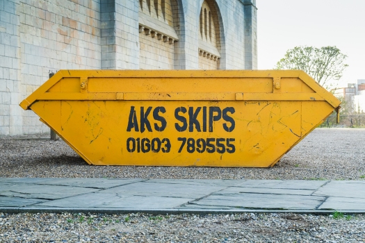
Skip (1 of 1)

Nero (1 of 1)

Sign (1 of 1)

In evaluating this work I think I have tried to make the castle incidental, to say something about the environment, something about the things that are in its immediate environment. In some of the images I wanted to contrast the old and the new. 

My images are fundamentally different to the google images in that they:

  • Do not present the castle as the principle object in the frame
  • Say something about the environment the castle sits within
  • Make the castle incidental in the images
  • Almost make the castle appear hidden or even just hinted at

Contact Sheets with annotation.

From the 120 images I took for this exercise I narrowed the selection down to just under 50. These are set out in the contact sheets below and as required in the exercise they are my annotated versions. To show the annotations I printed the contact sheets, wrote on them and then scanned them to show the annotations. The third page has a simple key to how I marked the images for selection or rejection.

EYV Ex 4.5 v1

EYV Ex 4.5 v2

EYV Ex 4.5 Contact 3

References

Bloomfield, R. (2014) Expressing Your Vision, Open College of the Arts, Barnsley

Davies, J. (2008) Fuji City found at: http://www.johndavies.uk.com/fuji%20text.htm (Accessed 12 November 2015)

Delaney, P. (2004) The Charm of the Alien, The Guardian On Line 21-2-2004, (Accessed 11th November 2015)

Sontag, S. (1977) On Photography, Penguin, London

Steele-Perkins, C. (1998) Fuji- found at: http://www.magnumphotos.com/C.aspx?VP3=SearchResult&ALID=29YL53IUJG8 (Accessed 11th November 2015)


Exercise 4.4

Use a combination of quality, contrast, direction and colour to light an object in
order to reveal its form. For this exercise we recommend that you choose a natural or
organic object such as an egg, stone, vegetable or plant, or the human face or body,
rather than a man-made object. Man-made or cultural artifacts can be fascinating
to light but they also contain another layer of meaning requiring interpretation by
the photographer; this exercise is just about controlling the light to reveal form.
You don’t need a studio light for this exercise; a desk lamp or even window light will
be fine, although a camera flash that you can use remotely is a useful tool. The only
proviso is that you can control the way the light falls on the subject.

Take some time to set up the shot. The background for your subject will be crucial.
For a smallish object, you can tape a large sheet of paper or card to the wall as an
‘infinity curve’ which you can mask off from the main light source by pieces of card.
You don’t need to use a curve if you can manage the ‘horizon line’ effectively – the
line where the surface meets background. Taking a high viewpoint will make the
surface the background, in which case the surface you choose will be important to
the shot.

Exposure times will be much longer than you’re used to (unless you’re using flash)
and metering and focusing will be challenging. The key to success is to keep it
simple. The important thing is to aim for four or five unique shots – either change
the viewpoint, the subject or the lighting for each shot.

Add the sequence to your learning log. Draw a simple lighting diagram for each of
your shots showing the position of the camera, the subject and the direction of the
key light and fill. Don’t labour the diagrams; quick sketches with notes will be just
as useful as perfect graphics. In your notes try to describe any similarities between
the qualities of controlled lighting

Exercise 4.4

This was an interesting and in many respects very challenging activity. Unlike all the other aspects of the course exercises so far I had never undertaken any studio type shooting with lights. And whilst I have lots to learn in daylight and night time image making, I was an absolute novice at using lights to illuminate a subject.

I even put off doing the activity several times, in part due to my trepidation!

However I re-read the exercise details and the preceding sections of the course materials that described the four elements of studio lighting, quality, contrast, direction and colour.

I pondered for some time on light sources and eventually decide to use two identical halogen bulb desk lamps. These were the only directable artificial light sources I owned and although not ideal I built my mini studio around these light sources.

Using a desk set against a wall I mounted a thick white sheet to a high self and let it fall down in a curve to the top of the desk. To create a bit of a curve to the back drop I used gaffer tape.

studio 4

Makeshift Studio

I also pondered for some time on the choice of object/subject for the exercise. I was mindful of the course notes expectations that an organic rather than man made object was best use for this activity. With perfect timing a Sainsbury’s delivery offered me my subject in the form of a very fresh and colourful Brassica Oleracea, or to use its more common name a green cabbage!

I feel that I did really embraced the ‘Ex Nihilo’ concept and create my studio shoot and the attendant lighting effects out of nothing, or at least out of the things around me!

To make the images I used a camera with a 53mm (35mm on a 1.5 crop sensor) lens, placed on a tripod with a cable release. I tried a variety of camera and subject positions and settled for a shooting positions with the camera higher than the subject, with the camera at close proximity and the subject filling the camera frame.I also shot with the camera tethered to my computer to allow quick review of the images. This must be a boon for studio photographers?

I immediately picked up why studios don’t as far as I could see use halogen light sources. There was a strong purple cast from the lighting that all the White Balance Modes on my camera struggled with and in the end I removed the cast in post processing.

I did use a variety of positions as well as experimenting with diffusing the light sources with tracing paper and filters. In reality the filtered images simply didn’t work so my final selection are images where I used some different light quality, a variety of directions including below , level and above the subject. I also managed the contrast using the camera settings and light directions combinations

Set out below are some of the images I took with an associated lighting diagrams.

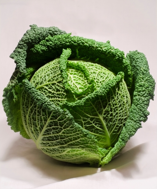
Ex Nihilo- Brassica Oleracea

Ex4.4 no. 2 (1 of 1)

53mm, f7.1, 1/5 sec, ISO 200

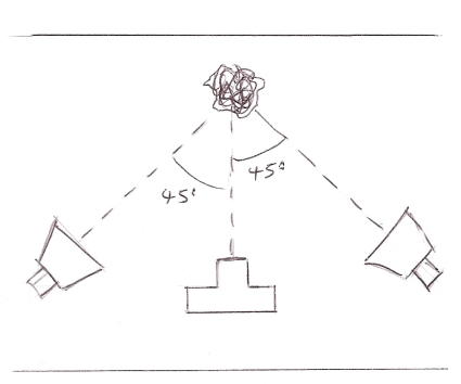
Lighting 6

the simplest of the lighting setup. Two lamps at the same height and both at 45 degrees to the subject.

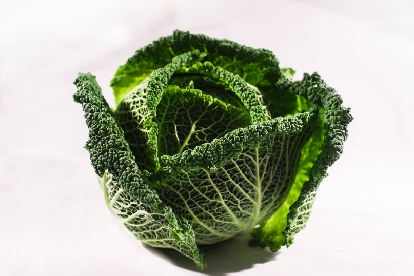
Ex4.4 no. 3 (1 of 1)

53mm, f7.1, 1/15 sec, ISO 200

Lighting 22

Another simple lighting set up , both lamps at the same height but this time one at 45 degrees to the subject and the other at 90 degrees

Ex4.888 no

53mm, f7.1, 1/15 sec, ISO 200

Lighting 2

In this image a I experimented with the quality and direction of the light. I used a large piece of tracing paper to diffuse the light source. I also placed the lamp about half a meter higher than the subject. for the second light source I moved this much closed to the camera and again set it about half a meter higher than the subject. the effect was quite differ to the previous shots.

EYV Ex 4.4 (1 of 1)

53mm, f3.2, 1/150 sec, ISO 2000

Lighting 5

For this image I diffused the light from both lamps and again experimented with the angles and height of the lights. the left hand light was set at a height of 1 meter above the subject, the right hand light was set at a height if half a meter.

Exercise 4.3

Capture ‘the beauty of artificial light’ in a short sequence of shots (‘beauty’ is, of
course, a subjective term). The correct white balance setting will be important; this
can get tricky –but interesting – if there are mixed light sources of different colour
temperatures in the same shot. You can shoot indoors or outside but the light should
be ambient rather than camera flash. Add the sequence to your learning log. In your
notes try to describe the difference in the quality of light from the daylight shots in
Exercise 4.2.

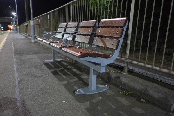
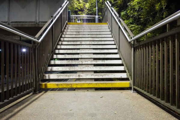
As some one who has predominantly made images in daylight this was an internist exercise. I used a range of opportunities to take photographs while travelling early one morning by train. On another occasion I looked at shops signed and lighting.

Artificial lights introduces number of colours that I image are to do with the nature if the light source. Lighting that can range from Tungsten, although less frequent now, through to sodium, haulage, neon and increasing the light from Light Emitting diodes.

All have defiant frequencies and give very different tone, clouds and hues to the light from the sun.

Below are a few shots taken in different condition that show these ocular and tone differences. Of course another key factor is the relatively high contrast ratio given that artificial light is often (although not always) seen against the backdrop of the night.

Car Park 2 (1 of 1)

bench 2 (1 of 1)

Steps 2 (1 of 1)

Leon 2(1 of 1)

Chop'd 2 (1 of 1)

Exercise 4.2

In manual mode take a sequence of shots of a subject of your choosing at different
times on a single day. It doesn’t matter if the day is overcast or clear but you need
a good spread of times from early morning to dusk. You might decide to fix your
viewpoint or you might prefer to ‘work into’ your subject, but the important thing is
to observe the light, not just photograph it. Add the sequence to your learning log
together with a timestamp from the time/date info in the metadata. In your own
words, briefly describe the quality of light in each image.

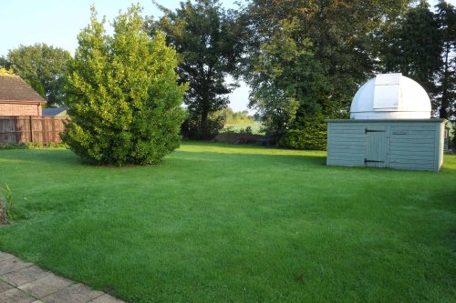
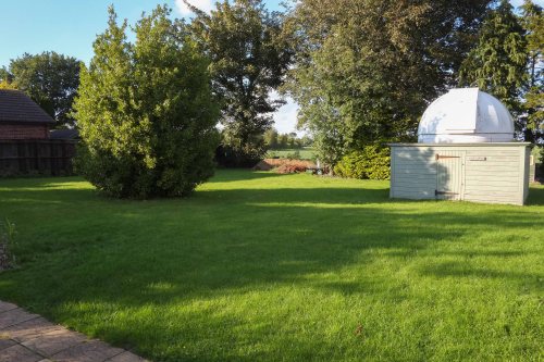
Although not the most interesting of scenes, I chose to make images of a  single location at 30 minute intervals during a single day. I used a fixed focus wide angle lens and mounted the camera on a tripod to retain the same view point through the shooting cycle. My first images were made at 7.30am and the final image was made at 19.30.

From these I selected a range of images taken about 1 hour apart. They record the changing light through what was quite a bright late summers day. The camera was set in manual mode and I adjusted the exposure to maintain a well exposed image. From these I selected a number of images that were about an hour apart and that shod the changing light an shades through the day.

8:00, 9:00 and 10:00am

F8.00 (1 of 1)

F9.00 (1 of 1)

F10.00 (1 of 1)

In this first sequences the sun remains low, slowly rising and casting long shadows. There is also evidence of what is sometimes called ‘golden hour’ light. It is a light that can be very orange and long in wavelength. This caused by the low sun having to starve through a thicker layer of atmosphere with has the effect of filtering some of the bluer shorter wavelengths, the effect is relatively short lived and by the end of this first sequence there is a bright more even set of colours. The green of the lawn, bushes and trees is quite intense in this first sequence and the grass almost glows. The images are very contrasty and there is quite a range of hues within the colours in the shots.

11:00,12:00 and 1:00pm

F11.05 (1 of 1)

F12.05 (1 of 1)

F13.05 (1 of 1)

In the second sequence the first image was taken with the sky somewhat overcast. This has the effect of subduing the shadows and to some extent ‘dulling’ the colours, there is no longer the vibrancy of the bright some light. There is however  an evenness about the light in the scene and as all the harsh shadows have gone I can see why architectural photographers prefer this sort of even light to capture the detail in buildings. Also the sun is higher in the sky and when shadows appear in the next two images they are shorter and less harsh.

2:00, 3:00 and 4:00pm

F14.05 (1 of 1)

F15.00 (1 of 1)

F16.00 (1 of 1)

The progress of the sun is much more evident in the next set of images. By the 4pm image and the direction of the shadows is quite different to this initial shots. there is still a brightness and glow caused by the direct sunlight unhindered by clouds. By the 4pm image here is a hint of the golden hue seen in the morning images, again caused by some of the blue light being filtered by the atmosphere. 

5:00, 6:00 and 7:00pm

F17.00 (1 of 1)

F18.00 (1 of 1)

F19.00 (1 of 1)

In the 5pm image the golden hue is even stronger and the long and distinct shadows attest to the setting sun. However by the final two images the sky has become overcast, shadows are far less obvious, although still evident and there is a very even but uninteresting light.

This was an interesting exercise that demonstrated the range of factors that influence the quality of the light in an image. These include the:

  • time of the day
  • height of the sun
  • weather conditions
  • the subject matter and how it reflects or absorbs light

Exercise 4.1

1. Set your camera to any of the auto or semi-auto modes. Photograph a dark tone
(such as a black jacket), a mid-tone (the inside of a cereal packet traditionally
makes a useful ‘grey card’) and a light tone (such as a sheet of white paper),
making sure that the tone fills the viewfinder frame (it’s not necessary to focus).
Add the shots to your learning log with quick sketches of the histograms and
your observations.

You might be surprised to see that the histograms for each of the frames – black, grey and white – are the same. If there’s not much tonal variation within the frame you’ll see a narrow spike at the mid-tone; if there is tonal variation (such as detail)  you’ll see a more gentle curve. If you find the tone curve isn’t centered on the mid-tone, make sure that you have your exposure compensation set to zero. You may see an unpleasant colour cast if you’re shooting under artificial light, in which case you can repeat the exercise using your monochrome setting (a light meter is sensitive to brightness, not to colour). This simple exercise exposes the obvious flaw in calibrating the camera’s light meter to the mid-tone. The meter can’t know that a night scene is dark or a snow scene is light so it averages each exposure around the mid-tone and hopes for the best. But why can’t the camera just measure the light as it is?

The reason is that a camera measures reflected light – the light reflected from the subject, not incident light – the light falling on the subject. To measure the incident light you’d have to walk over to the subject and hold an incident light meter (a hand- held meter) pointing back towards the camera, which isn’t always practical. If you did that each of the tones would be exposed correctly because the auto or semi-auto modes wouldn’t try to compensate for the specific brightness of the subject.

2. Set your camera to manual mode. Now you can see your light meter! The mid tone
exposure is indicated by the ‘0’ on the meter scale with darker or lighter
exposures as – or + on either side. Repeat the exercise in manual mode, this time
adjusting either your aperture or shutter to place the dark, mid and light tones
at their correct positions on the histogram. The light and dark tones shouldn’t
fall off either the left or right side of the graph. Add the shots to your learning log
with sketches of their histograms and your observations.

Switching to manual mode disconnects the aperture, shutter and ISO so they’re no
longer linked. Because they’re no longer reciprocal, you can make adjustments to
any one of them without affecting the others.

Exercise 1.1

Ex 4.1 Desk (1 of 1)

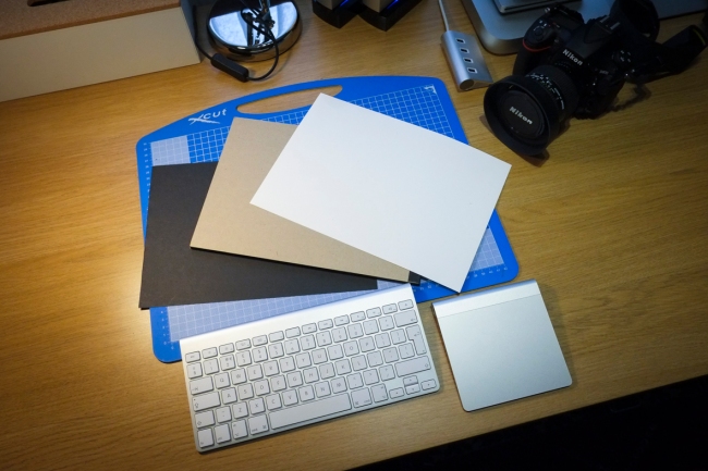
As directed in the course exercise about photographing black, grey and white objects, I used a 1.5x crop sensor camera with a 60mm (90mm full frame equivalent) lens and focused on black, white and neutral grey cards. In actual fact the grey card was more brown but still neutral. The portrait  lens used allowed me to fill the frame with the cards colour. The images are set out below:

White

White Auto (1 of 1)

Grey

Grey Auto Auto (1 of 1)

Black

Black Auto (1 of 1)

There are some variations in the tones and some strange vignetting (probably a result of the lens struggling to autofocus on the neutral subject and the uneven light from my desk lamp) but broadly they are very similar. I sketched these into my notebook and then photographed the page in the notebook.

Hist Auto (1 of 1)

Exercise 1.2

I then repeated the exercise but this time with the camera set to manual. The images again are set out below:

White

White Manual (1 of 1)

Grey

Grey Manual (1 of 1)

Black

Black Manual (1 of 1)

As can be seen these images print an all together different view of the three cards and begin to illustrate the point being made in this exercise. As in the first part of the exercise I did a drawing of the histograms in my notebook and these can be seen below:

HistManual (1 of 1)

This time the histograms are very different. with the camera in manual mode it is seeing the light reflecting back and no compensation is being applied as would occur in auto mode. 

I was aware of this principle and knew in advance that in auto mode the camera would set the bulk of the seen to a neutral mid tone. So it did not matter, grey, black or white, the auto meter would think grey. The camera does not know what it is seeing and in auto mode assumptions are applied. As this practical activity highlights the camera is easily tricked. 

Although I knew this in advance and had read many times of this effect it was valuable to actually prove the point through experiment!